Editor
The Editor is where screenshots and images are opened, edited, annotated, resized, transformed, saved, and shared. The workspace contains a ribbon toolbar, image tabs, rulers, a canvas, and a status bar.
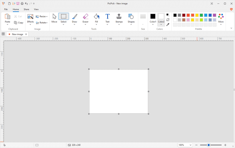
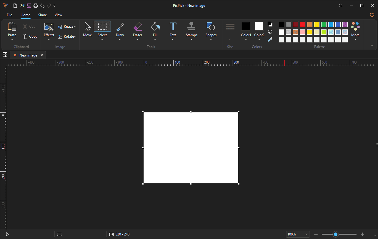
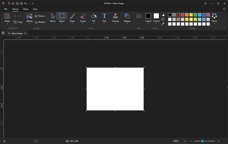
A dark-theme editor is also visible in the supplied screenshots.
Contents
- Top Tabs
- Quick Access Toolbar
- Home Tab
- Share Tab
- View Tab
- Image Tabs
- Canvas
- Rulers
- Status Bar
1. Top Tabs
| Tab |
Purpose |
| File |
Opens file and program commands such as Home, New, Open, Save, Save As, Print, Share, Options, About, and Exit. |
| Home |
Shows the main editing tools: clipboard, effects, resize, rotate, selection, drawing, erasing, fill, text, stamps, shapes, size, colors, and palettes. |
| Share |
Sends the current image to online services, cloud services, Microsoft Office apps, Paint, FTP, or an external program. |
| View |
Controls editor display options such as zoom, actual size, full screen, thumbnails, rulers, status bar, and tab visibility. |
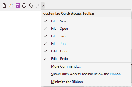
The Quick Access Toolbar appears at the top-left of the editor window. It provides one-click access to common commands.
2.1 Visible Buttons
| Button |
Purpose |
| File - New |
Creates a new image. |
| File - Open |
Opens an existing image. |
| File - Save |
Saves the current image. |
| File - Print |
Opens printing for the current image. |
| Edit - Undo |
Reverses the previous edit. |
| Edit - Redo |
Reapplies an edit that was undone. |
2.2 Customize Quick Access Toolbar Menu
Click the small arrow beside the quick access icons to open the customization menu.
| Menu item |
Purpose |
| File - New |
Shows or hides the New button on the toolbar. |
| File - Open |
Shows or hides the Open button on the toolbar. |
| File - Save |
Shows or hides the Save button on the toolbar. |
| File - Print |
Shows or hides the Print button on the toolbar. |
| Edit - Undo |
Shows or hides the Undo button on the toolbar. |
| Edit - Redo |
Shows or hides the Redo button on the toolbar. |
| More Commands... |
Opens additional customization settings. |
| Show Quick Access Toolbar Below the Ribbon |
Moves the toolbar below the ribbon. |
| Minimize the Ribbon |
Collapses the ribbon to save vertical space. |
3. Home Tab
The Home tab is the main editing tab. It is divided into the Clipboard, Image, Tools, Size, Colors, and Palette groups.

3.1 Clipboard Group
| Feature |
Purpose |
How to use |
| Paste |
Inserts clipboard content into the current image. |
Copy an image or object, then click Paste. |
| Cut |
Removes the selected area or object and places it on the clipboard. |
Select something, then click Cut. |
| Copy |
Copies the selected area or object to the clipboard. |
Select something, then click Copy. |
Paste Menu
| Menu item |
Shortcut |
Purpose |
| Paste |
Ctrl+V |
Pastes clipboard content into the current image. |
| Paste to New Tab |
Ctrl+Shift+V |
Creates a new image tab from the clipboard content. |
| Paste from File... |
Ins |
Inserts image content from a file. |
3.2 Image Group
| Feature |
Purpose |
How to use |
| Effects |
Applies visual effects and image corrections. |
Click Effects, then choose an effect. |
| Resize |
Changes image size or canvas size. |
Click Resize, then choose Image Resize... or Canvas Resize.... |
| Rotate |
Rotates or flips the image. |
Click Rotate, then choose a rotation or flip command. |
Effects Menu
| Effect |
Purpose |
| Invert |
Reverses the colors in the image. |
| Grayscale |
Converts the image to shades of gray. |
| Pixelate... |
Applies a pixelated effect to the image or selected area. |
| Frame... |
Adds or configures a frame around the image. |
| Watermark... |
Adds or configures a watermark. |
| Blur |
Blurs the image or selected area. |
| Sharpen |
Increases the apparent sharpness of image details. |
| Brightness / Contrast... |
Adjusts image brightness and contrast. |
| Hue / Saturation... |
Adjusts hue and color saturation. |
| Color Balance... |
Adjusts the balance of color channels. |
Resize Menu
| Menu item |
Shortcut |
Purpose |
| Image Resize... |
Ctrl+R |
Changes the dimensions of the image content. |
| Canvas Resize... |
Ctrl+E |
Changes the canvas area. This can add empty space or crop the available canvas. |
Rotate Menu
| Menu item |
Purpose |
| 90° clockwise |
Rotates the image 90 degrees clockwise. |
| 270° clockwise |
Rotates the image 270 degrees clockwise, equivalent to 90 degrees counterclockwise. |
| 180° |
Rotates the image upside down. |
| Rotate by Angle... |
Opens a custom-angle rotation dialog. |
| Flip Vertical |
Flips the image from top to bottom. |
| Flip Horizontal |
Flips the image from left to right. |
3.3 Tools Group
The Tools group contains the main editing and annotation tools.
| Feature |
Purpose |
Common use |
| Move |
Moves selected objects, pasted content, shapes, or selected areas. |
Repositioning annotations or selected regions. |
| Select |
Selects part of the image. |
Copying, cutting, moving, editing, or deleting a region. |
| Draw |
Draws freehand strokes. |
Highlighting, sketching, circling, or marking details. |
| Eraser |
Erases or retouches pixels. |
Removing content, removing background, blurring, sharpening, or distorting small areas. |
| Fill |
Fills areas with color, transparency, or replacement color. |
Coloring regions or replacing colors. |
| Text |
Adds text annotations. |
Labels, notes, explanations, or callouts. |
| Stamps |
Inserts ready-made symbol graphics. |
Number markers, cursor markers, arrows, icons, checks, crosses, and warning marks. |
| Shapes |
Inserts shapes, lines, arrows, and custom shapes. |
Boxes, circles, callouts, arrows, stars, and reusable shape annotations. |
Select Menu
| Selection type |
Purpose |
| Rectangular Selection |
Selects a rectangular area. |
| Elliptical Selection |
Selects an oval or circular area. |
| Freehand Selection |
Selects an irregular area drawn by hand. |
| Magic Wand Selection |
Selects an area based on similar pixels or colors. |
| Selection option |
Shortcut |
Purpose |
| Select All |
Ctrl+A |
Selects the entire image or canvas. |
| Invert Selection |
Ctrl+Shift+I |
Selects everything outside the current selection. Disabled until a selection exists. |
| Deselect |
Ctrl+D |
Removes the current selection. Disabled until a selection exists. |
Draw Menu
| Drawing tool |
Purpose |
| Pencil |
Draws a thin, simple freehand line. |
| Brush |
Draws a thicker brush stroke. |
| Soft Brush |
Draws a soft-edged stroke. |
| Calligraphy |
Draws a calligraphy-style stroke. |
| Airbrush |
Draws a sprayed or dotted stroke. |
| Marker |
Draws a marker-style stroke. |
Eraser and Retouch Menu
| Section |
Tool |
Purpose |
| Eraser |
Eraser |
Erases pixels, strokes, or editable content depending on the current context. |
| Eraser |
Background Eraser |
Removes background areas. |
| Retouch |
Smudge Tool |
Smears or blends pixels in the direction you drag. |
| Retouch |
Pixelation Tool |
Pixelates the area you brush over. |
| Retouch |
Blur Tool |
Blurs the brushed area. |
| Retouch |
Sharpen Tool |
Sharpens the brushed area. |
| Retouch |
Warp Tool |
Distorts or warps the brushed area. |
Fill Menu
| Fill type |
Purpose |
| Contiguous Fill |
Fills a connected area with the selected color. |
| Transparent Fill |
Fills or replaces an area with transparency. |
| Color Replacement Fill |
Replaces one color with another color. |
Text Menu
| Section |
Purpose |
| Default Text |
Inserts default text using the current text settings. |
| Text Style |
Provides preset text appearances, including colored, outlined, shadowed, and decorative styles. |
Stamps Menu
| Stamp category |
Visible examples |
Common use |
| Number Stamps |
Numbered circles in multiple colors. |
Marking steps, sequence, or points of interest. |
| Cursor Stamps |
Mouse pointer, hand pointer, text cursor. |
Showing where to click, hover, or type. |
| General Stamps |
Arrows, chevrons, map pins, flag, tag, question mark, exclamation mark, information mark, prohibited symbol, X, heart, plus, minus, check mark, and cross mark. |
Adding visual annotation symbols to screenshots. |
Shapes Menu
| Section |
Available items shown |
Common use |
| Shapes |
Rectangle, rounded rectangle, oval, circle, triangle, right triangle, diamond, pentagon, hexagon, numbered polygons, speech bubbles, callouts, plus, heart, lightning bolt, cloud, flag/banner shape, stars, and burst shapes. |
Drawing boxes, callouts, highlights, and annotation graphics. |
| Lines |
Straight line options and directional line variants. |
Underlining, dividing, or pointing without an arrow head. |
| Arrows |
Multiple outline arrow styles pointing left, right, up, down, and other directions. |
Directing attention to an area of the screenshot. |
| Custom Shapes |
Saved custom shape slots and an add button. |
Creating reusable custom shapes. |
3.4 Size / Line Settings
| Feature |
Purpose |
| Size |
Adjusts the thickness or size of drawing tools, lines, outlines, and shape borders. Choose the size before drawing when you need thicker or thinner marks. |
3.5 Colors Group
The Colors group controls the active drawing, fill, text, outline, and shape colors.
| Feature |
Purpose |
How to use |
| Color1 |
Primary color used by many tools, including drawing, outlines, text, and fills. |
Click Color1 and choose a color. |
| Color2 |
Secondary color used by tools that support a second color. |
Click Color2 and choose a color. |
| Black/white overlapping squares |
Quick default color control. |
Use to reset or switch to common foreground/background colors. |
| Swap colors icon |
Swaps Color1 and Color2. |
Click the curved double-arrow icon. |
| Eyedropper |
Samples a color from the image or screen. |
Click the eyedropper and select a color. |
Color1 / Color2 Menu Sections
| Section |
Purpose |
| Theme Colors |
Shows theme color columns with light and dark variations. |
| Standard Colors |
Shows a row of common basic colors. |
| Custom Colors |
Shows saved custom colors or empty custom color slots. |
| More Colors... |
Opens a larger color selection dialog. |
3.6 Palette Group
The Palette group provides quick access to color swatches and palette themes.
| Feature |
Purpose |
| Color Swatches |
Click a swatch to set the active color. |
| More |
Opens additional palette and theme choices. |
| Menu section |
Option |
Purpose |
| Palette Type |
Pastel Colors |
Uses a softer pastel palette. |
| Palette Type |
Primary Colors |
Uses a primary-color palette. |
| Theme Colors |
Default |
Uses the default theme colors. |
| Theme Colors |
Theme 1 |
Switches to Theme 1. |
| Theme Colors |
Theme 2 |
Switches to Theme 2. |
| Theme Colors |
Theme 3 |
Switches to Theme 3. |
| Theme Colors |
Theme 4 |
Switches to Theme 4. |
| Theme Colors |
Theme 5 |
Switches to Theme 5. |
4. Share Tab
The Share tab sends the current image to a service, Microsoft Office application, Paint, FTP server, or external program.
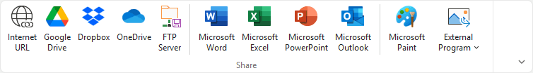
| Destination |
Purpose |
| Internet URL |
Creates or opens an online sharing workflow for the image. |
| Google Drive |
Sends the image to Google Drive. |
| Dropbox |
Sends the image to Dropbox. |
| OneDrive |
Sends the image to Microsoft OneDrive. |
| FTP Server |
Uploads the image to a configured FTP server. |
| Microsoft Word |
Sends or inserts the image into Microsoft Word. |
| Microsoft Excel |
Sends or inserts the image into Microsoft Excel. |
| Microsoft PowerPoint |
Sends or inserts the image into Microsoft PowerPoint. |
| Microsoft Outlook |
Sends the image through Microsoft Outlook. |
| Microsoft Paint |
Opens the image in Microsoft Paint. |
| External Program |
Sends the image to a configured external application. |
5. View Tab
The View tab controls how the editor workspace is displayed.
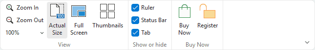
5.1 View Group
| Feature |
Purpose |
| Zoom In |
Increases the zoom level. |
| Zoom Out |
Decreases the zoom level. |
| Zoom percentage dropdown |
Selects or displays the current zoom percentage. The screenshot shows 100%. |
| Actual Size |
Shows the image at actual size. |
| Full Screen |
Switches the editor view to full-screen mode. |
| Thumbnails |
Shows or hides the thumbnail panel. |
5.2 Show or Hide Group
| Feature |
Purpose |
| Ruler |
Shows or hides rulers. The screenshot shows this enabled. |
| Status Bar |
Shows or hides the bottom status bar. The screenshot shows this enabled. |
| Tab |
Shows or hides image tabs. The screenshot shows this enabled. |
5.3 Buy Now Group
| Feature |
Purpose |
| Buy Now |
Opens the purchase workflow. |
| Register |
Opens the license registration workflow. |
6. Image Tabs
Open images appear as tabs near the top of the workspace. The active tab shows the current document name and a close button.
Image Tab Context Menu
Right-click an image tab to open the context menu.
| Menu item |
Purpose |
| Rename... |
Renames the current tab or document title. |
| Open File Location... |
Opens the folder containing the image file. Disabled when the image has no saved file path. |
| Copy Path to Clipboard |
Copies the file path of the image. Disabled when the image has no saved file path. |
| Delete File |
Deletes the file from disk. Disabled when the file cannot be deleted or has not been saved. |
| Copy |
Copies the current image or selection. May be disabled depending on state. |
| Save |
Saves the current image. |
| Close |
Closes the active image tab. |
| Close All |
Closes all open image tabs. |
7. Canvas
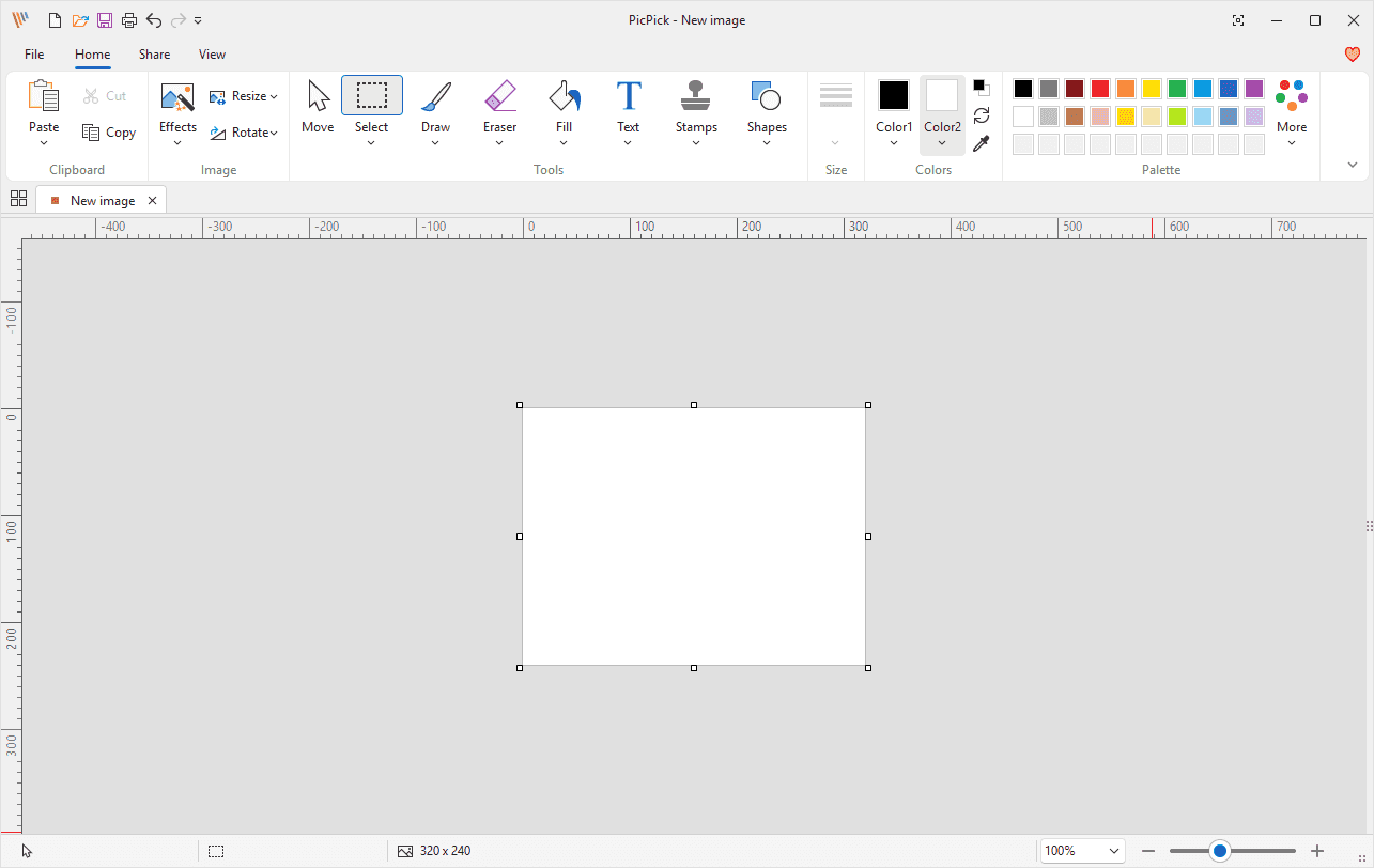
The canvas is the editable image area. In the supplied editor screenshot, the blank white canvas is selected and resize handles are visible.
| Element |
Purpose |
| Canvas |
The editable image area. |
| Selection handles |
Small squares around a selected canvas, object, or selection. Drag handles to resize or adjust the selected item. |
| Workspace background |
The area around the canvas. It visually separates the image from the editor interface. |
8. Rulers
Horizontal and vertical rulers appear around the canvas when enabled.
| Feature |
Purpose |
| Horizontal ruler |
Helps measure X position and width across the image. |
| Vertical ruler |
Helps measure Y position and height down the image. |
9. Status Bar
The status bar appears at the bottom of the editor.
| Feature |
Purpose |
| Image size display |
Shows the current image dimensions. The dark-theme screenshot shows 760 x 859. |
| Zoom percentage |
Shows the current zoom level. The screenshot shows 100%. |
| Zoom slider |
Provides visual zoom control using minus, slider, and plus controls. |